7.5 KiB
| title | date | tags | categories | |||
|---|---|---|---|---|---|---|
| Flutter初见 | 2019-10-21 22:38:25 |
|
|
搭建开发环境
- 下载解压Flutter的sdk,并且将其中的bin目录配置到环境变量
- Android Studio安装安卓SDK,通常启动时如果未安装过都会自动执行下载安装
- Android Studio安装Flutter的插件
 安装flutter插件时会自动安装其依赖的dart插件
 - 在Android Studio的
AVD Manager当中创建模拟器(需要选择屏幕尺寸以及安卓系统版本,当前系统中不存在的版本需要下载) 如果使用真机调试运行,该步骤可以跳过
执行flutter doctor可以检验当前环境当中存在的问题
 可以看到IDEA也是支持的,但是我们不打算使用IDEA来进行开发,所以就不在IDEA当中安装插件了
No devices available代表还未启动虚拟机或者连接真机
其余几项都是校验通过的
可以看到IDEA也是支持的,但是我们不打算使用IDEA来进行开发,所以就不在IDEA当中安装插件了
No devices available代表还未启动虚拟机或者连接真机
其余几项都是校验通过的
创建flutter项目
当Android Studio的flutter插件安装无误之后,就可以创建flutter项目了
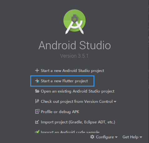
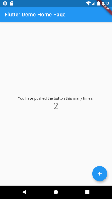
新建的是一个flutter的demo项目
包含一个标题栏,一个按钮,和中间区域内的若干文字
点击按钮时进行计数,文字会相应变化
项目当中包含一个main.dart文件 内容如下
// 引入material样式
import 'package:flutter/material.dart';
// 程序运行入口
void main() => runApp(MyApp());

// App实体类
class MyApp extends StatelessWidget {
  // This widget is the root of your application.
  @override
  Widget build(BuildContext context) {
    return MaterialApp(
      title: 'Flutter Demo',
      theme: ThemeData(
        // 主题样式
        primarySwatch: Colors.blue,
      ),
      // 首页对象以及首页的标题
      home: MyHomePage(title: 'Flutter Demo Home Page'),
    );
  }
}

class MyHomePage extends StatefulWidget {
  MyHomePage({Key key, this.title}) : super(key: key);

  final String title;

  @override
  _MyHomePageState createState() => _MyHomePageState();
}

class _MyHomePageState extends State<MyHomePage> {
  int _counter = 0;

  void _incrementCounter() {
    setState(() { // 计数方法
      _counter++;
    });
  }

  @override
  Widget build(BuildContext context) {
    return Scaffold(
      appBar: AppBar(
        // 标题栏
        title: Text(widget.title),
      ),
      body: Center( // 居中元素
        // 子元素
        child: Column(
          mainAxisAlignment: MainAxisAlignment.center,
          children: <Widget>[
            Text(
              'You have pushed the button this many times:',
            ),
            Text( // 文字元素以及样式
              '$_counter',
              style: Theme.of(context).textTheme.display1,
            ),
          ],
        ),
      ),
      // 浮动按钮
      floatingActionButton: FloatingActionButton(
        onPressed: _incrementCounter, // 点击事件
        tooltip: 'Increment',
        child: Icon(Icons.add), // 子元素是一个图标
      ),
    );
  }
}
以上代码当中构建对象都省略了new关键字 其中的每个对象都是一个组件(Widget)
常用组件
组件以及组件的一些属性,基本算是前端html和css的思想
Text组件
这是一个文本组件,可以用于在App当中显示文字
Text(
  '这是一段文字',
  textAlign: TextAlign.left, // 文本对齐方式(左对齐)
  maxLines: 3, // 最大显示行数
  overflow: TextOverflow.ellipsis, // 文本长度溢出的处理方式(显示为...)
  style: TextStyle(
    color: Color.fromARGB(255, 20, 130, 40), // 文字颜色
    fontSize: 20, // 字号大小
    decoration: TextDecoration.underline, // 下划线
    decorationStyle: TextDecorationStyle.solid // 下划线类型
  )
)
容器组件
就是Container类以及它的一些子类
可以简单理解为div,通常用来方便控制布局
Container(
  child: Text(
    '这是一段文字',
    style: TextStyle(fontSize: 40),
  ),
  alignment: Alignment.bottomLeft, // 底部居左对齐
  color: Color.fromARGB(255, 50, 50, 50), //内部文字的颜色
  margin: EdgeInsets.fromLTRB(10, 20, 10, 30), // 左 上 右 下
)
属性也都很容易理解,可以设置容器的宽高,内外边距等等
decoration属性可以用来修饰容器 比如边框、背景色等
Container(
  width: 500,
  height: 300,
  padding: EdgeInsets.all(20), // 内边距
  decoration: BoxDecoration( // 容器修饰
    // 边框
    border: Border.fromBorderSide(BorderSide(color:Colors.amber, width:5)),
    // 背景过渡色
    gradient: LinearGradient(
      colors: [Colors.blueAccent, Colors.pinkAccent]
    )
  ),
  child: Text('Hello'),
),
图片组件
Image是图片组件
显示图片的方式有4种
- Image.asset - 加载资源图片,资源图片需要打包在APP当中
- Image.network - 网络资源图片
- Image.file - 设备本地的图片,比如相机拍照后的图片预览
- Image.memory - 加载内存中的图片,Uint8List
Image.network(
  'https://www.colorfulsweet.site/api/v1/common/randomBg?id=5d79b8606867833591833ae4', // 图片地址
  scale: 1.5, // 缩放(值越大图片显示越小)
  fit: BoxFit.fitHeight, // fit属性指定控制图片拉伸适应容器的方式, 这里是按高度适应
),
图片混合模式
可以给图片混合上一种颜色,类似于添加滤镜
Image.network(
  'https://www.colorfulsweet.site/api/v1/common/randomBg?id=5d79b8606867833591833ae4',
  color: Colors.lightGreen, // 混合的颜色
  colorBlendMode: BlendMode.lighten, // 混合的模式
  repeat: ImageRepeat.repeat, // 平铺充满容器
),
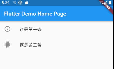
列表组件
就是ListView组件
通常用于数据列表的展示
ListView(children: <Widget>[
    ListTile(
      leading: Icon(Icons.access_time),
      title: Text('这是第一条'),
    ),
    ListTile(
      leading: Icon(Icons.android),
      title: Text('这是第二条'),
    )
  ],
),
ListView其中的children是一个Widget数组
其中可以是任意的组件,纵向列表通常使用ListTile(列表瓦片)来作为列表成员
其中的leading和title都可以是任意组件,可以利用各种组件的组合来构造出漂亮的列表
ListView有属性scrollDirection,表示列表元素的排列方向,默认是纵向的
如果设置为 Axis.horizontal 可以实现横向的列表
自定义组件
当页面结构很复杂的时候,如果我们把原生组件都堆积在一起 就会产生非常多的嵌套结构,造成代码难以维护 所以就很有必要创建自定义的组件,进行封装和重用
class MyList extends StatelessWidget {
  @override
  Widget build(BuildContext context) {
    return Container(child:
      ListView(
        scrollDirection: Axis.horizontal,
        children: <Widget>[
        Container(
          width: 150,
          color: Colors.pinkAccent,
        ),
        Container(
          width: 150,
          color: Colors.blue,
        ),
        Container(
          width: 150,
          color: Colors.lightGreen,
        ),
        Container(
          width: 150,
          color: Colors.amber,
        ),
        ],
      ),
      height: 100,
    );
  }
}
封装的组件就是这样一个继承StatelessWidget的类
可以放在任意一个需要使用Widget的地方